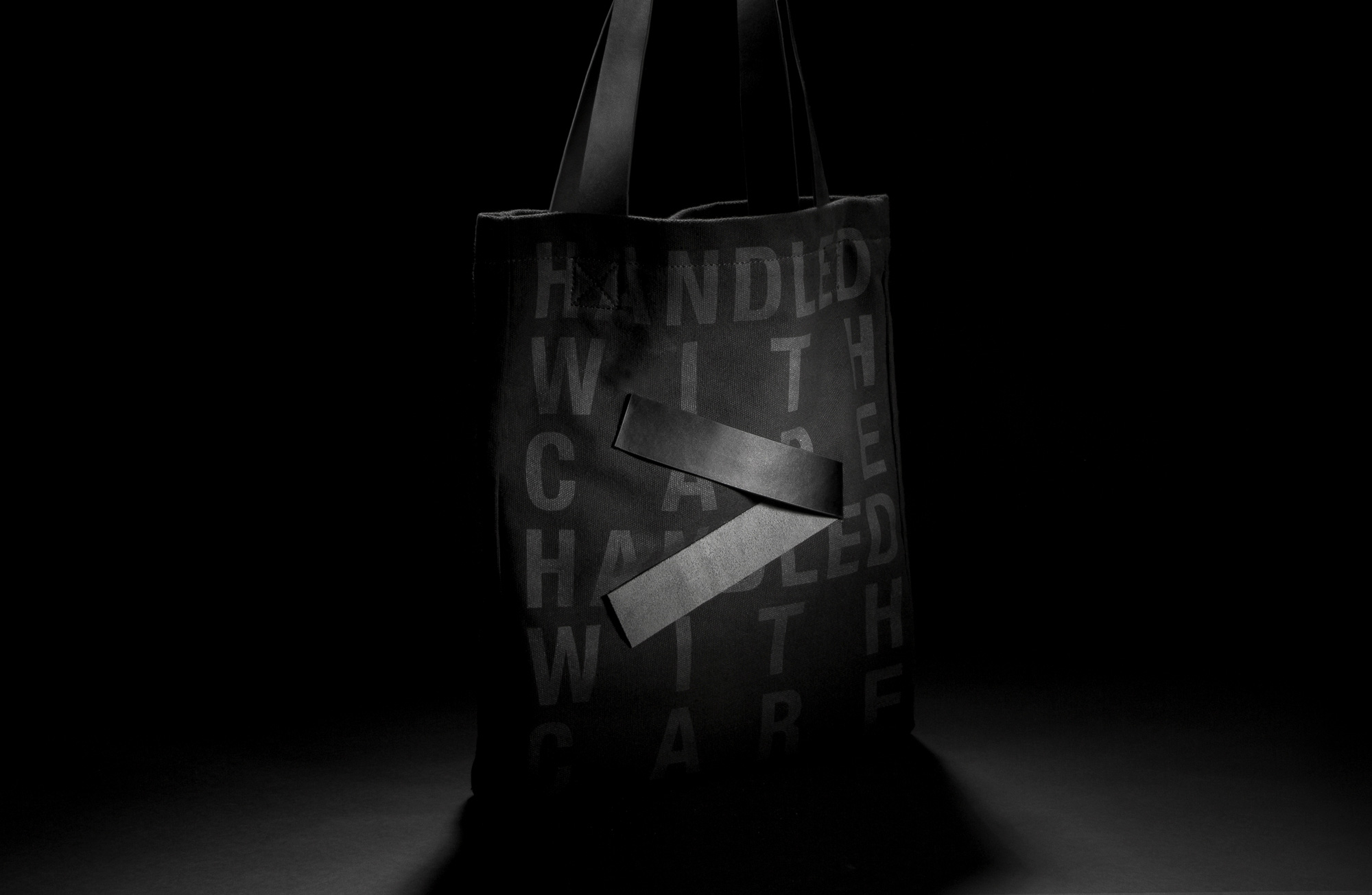
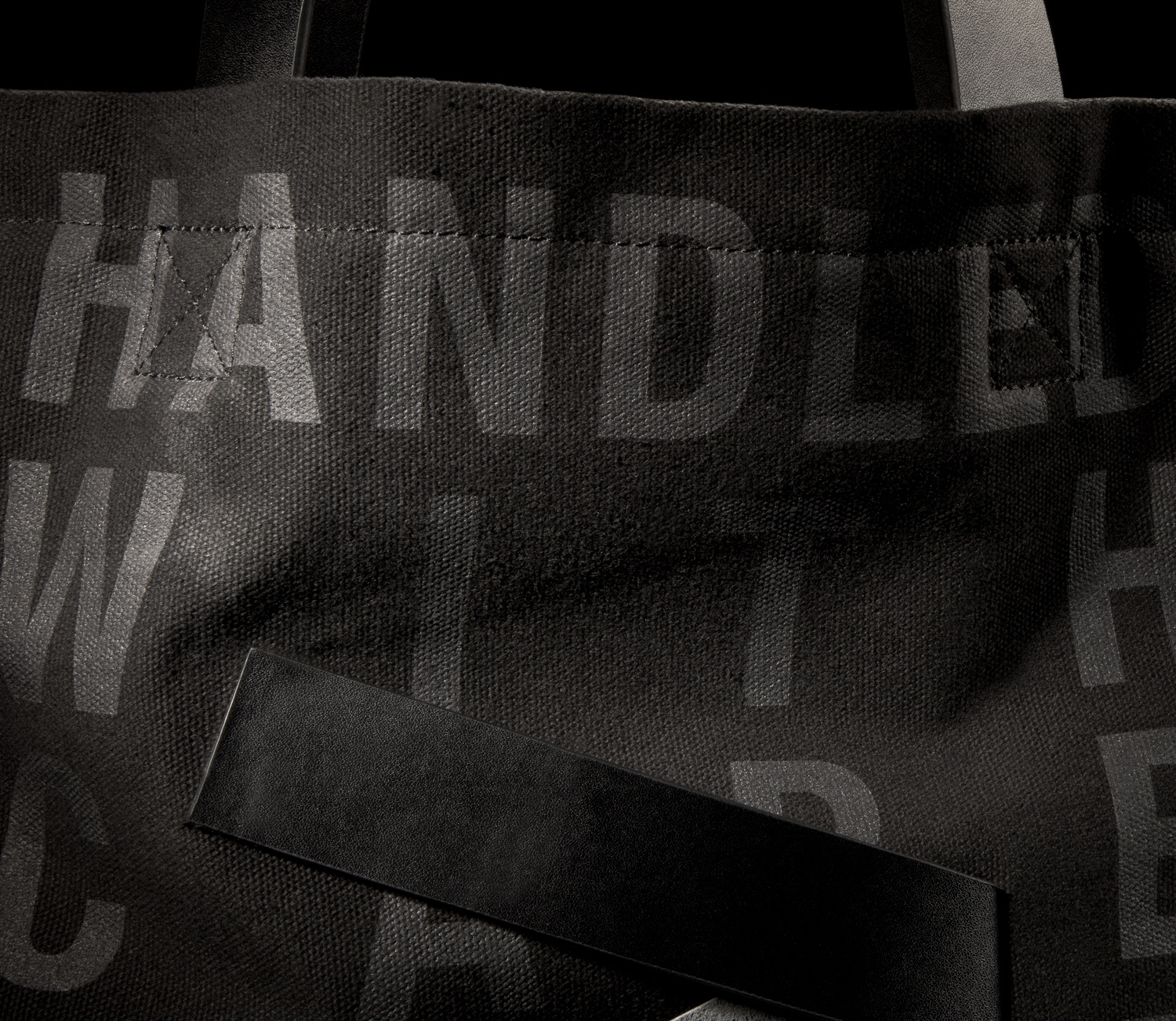
HANDLED WITH CARE
It had been a decade since Progress was last rebranded, meaning that in 2016 the time for a company facelift had definitely arrived. The old logo had been around since 2006 and it was time to showcase what we do best by promoting ourselves with a new image and a complete website overhaul.
Design Project were the masterminds behind the rebrand, giving us the Handle With Care tagline that really emphasised what we at Progress stand for when it comes to dealing with our clients and our products.
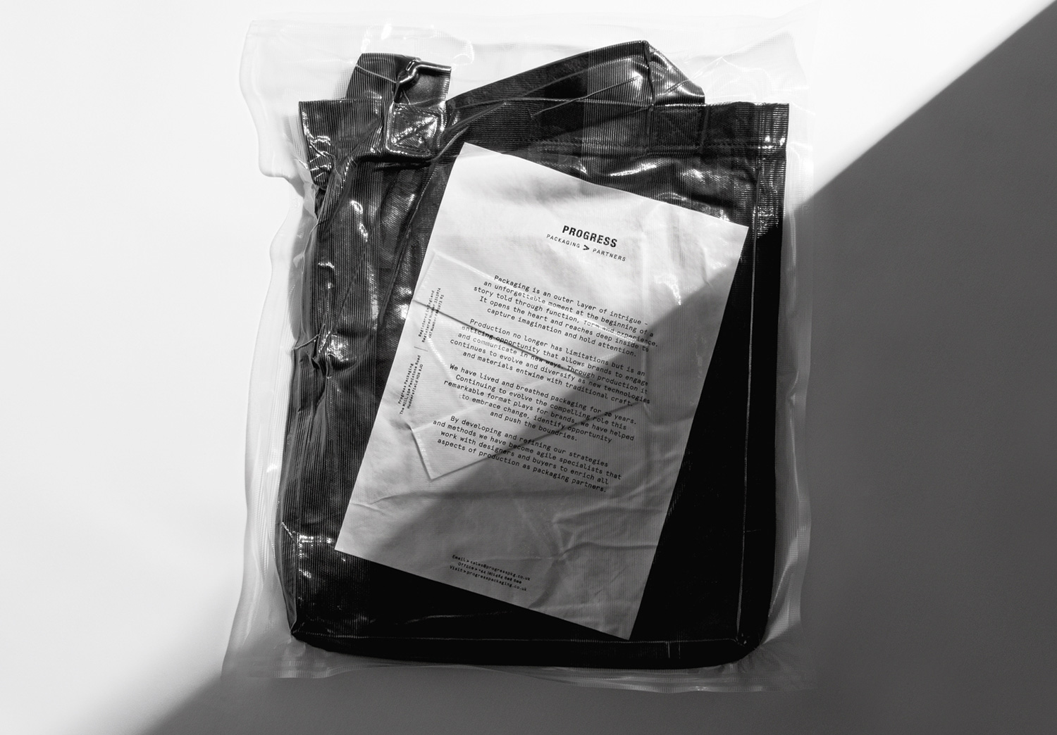
Having forged strong relationships with hundreds of customers in the last twenty years—featuring retailers, design agencies, and end users—we wanted to create a self-promotional item that we could send out to those people to let them know of our changes, while also showing the high standards we can achieve with our packaging when quality design meets quality manufacturing.
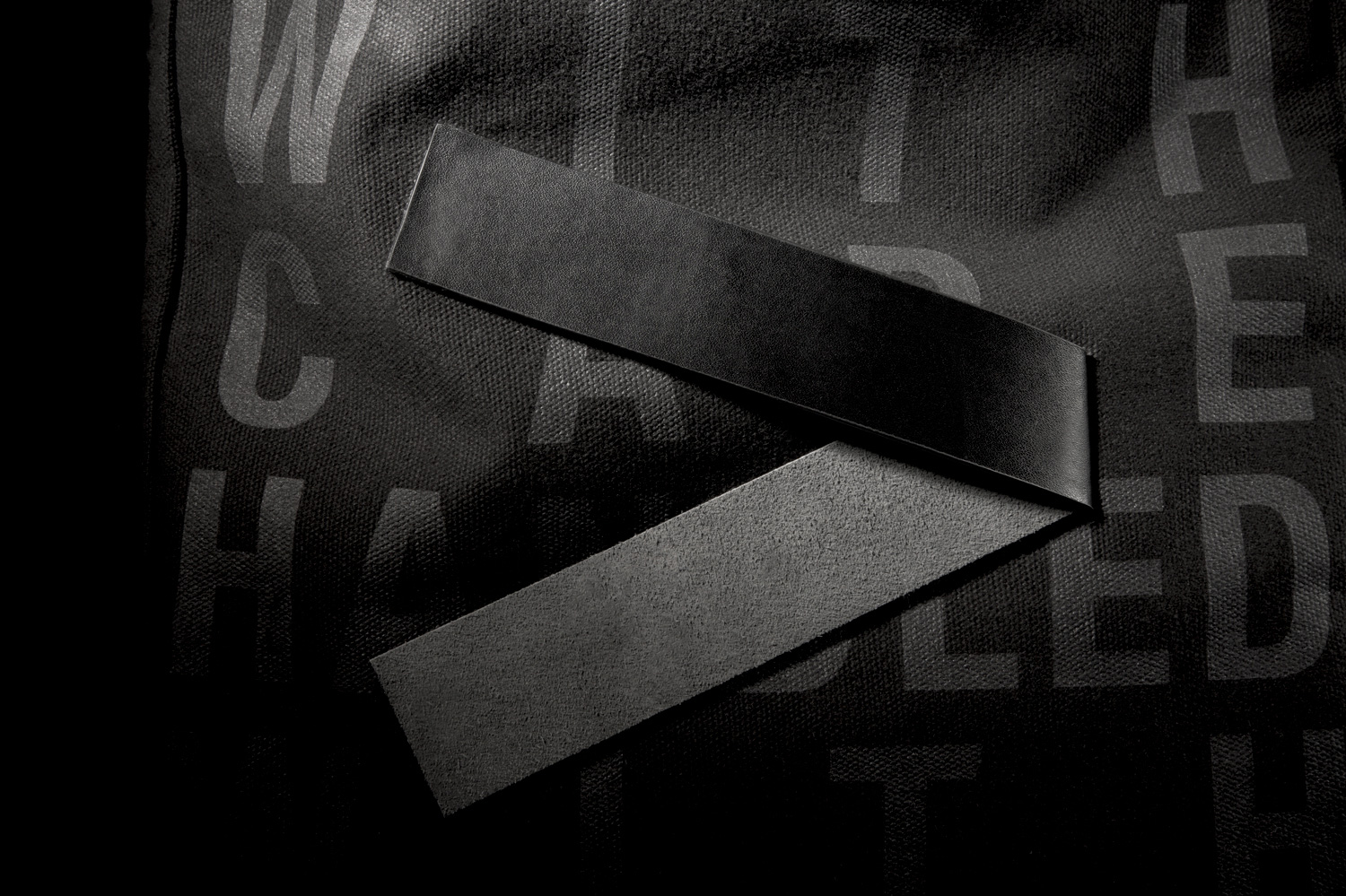
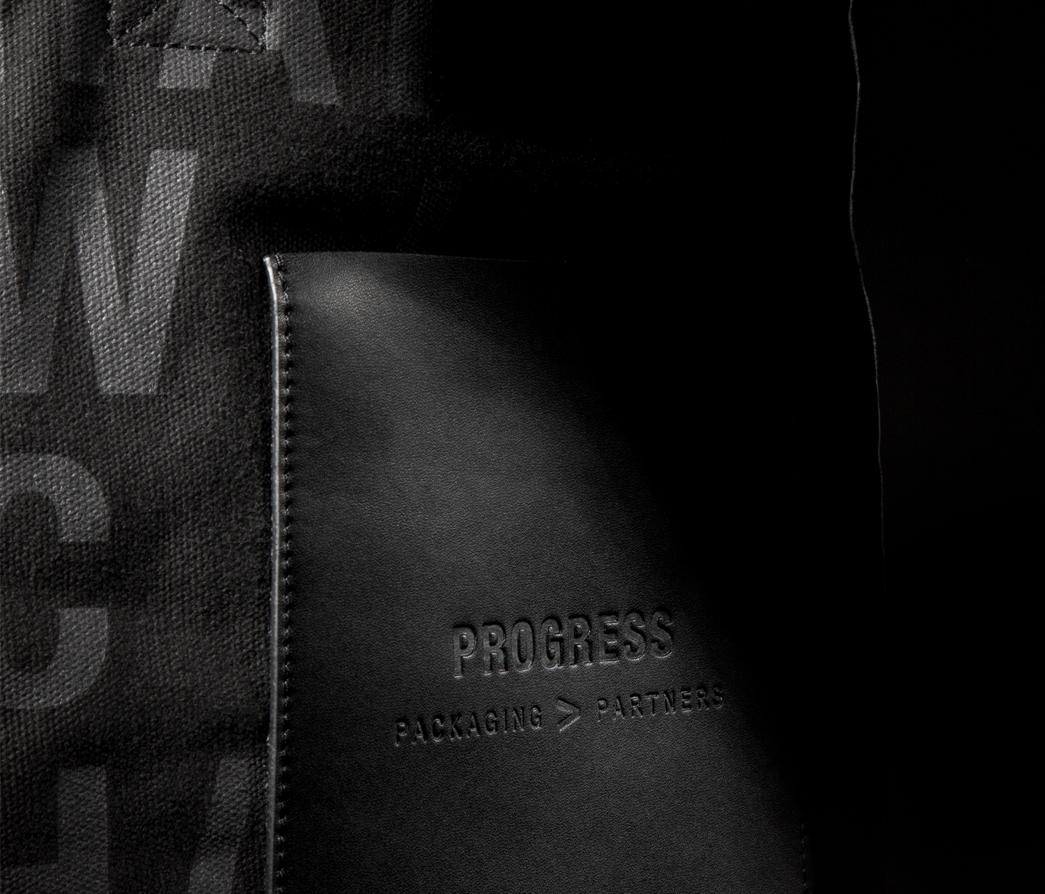
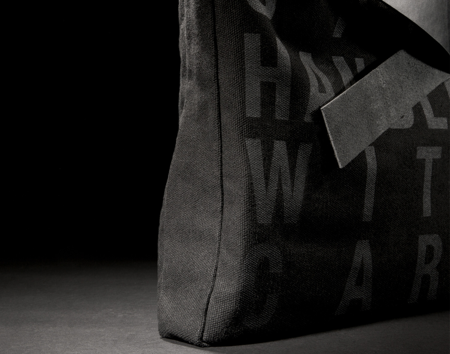
This beautiful bag was crafted for the new arrow logo launch using 16oz black canvas lined material with matching twill on the inside. Strong, thick bridle leather handles and a leather, debossed pocket were attached to provide contrasting textures to the item, with a black screen print being used on the outer faces.
Quoting their take on this project, Design Project said: ‘Our strategy was to create a new visual identity and position the business as ‘Packaging Partners’ defining their appeal to buyers, production managers, marketeers and agencies alike. A key aspect of the identity is the Progress arrow—a visual device used to express and articulate the on going story of the brand.’
